

Cover art is one of the most important aspects of an album, and it doesn’t even directly relate to the music itself. There have been a handful of times where I’ve bought or downloaded an album strictly because of how visually striking or ridiculous the cover art was. So I made a shortlist of the good, the bad and the ugly:
The Good
1.) Deafheaven – “Sunbather”

I am in no way an authority in black metal, hardcore punk, that weird music where they scream into the microphone or whatever you want to call it, but this album manages to floor me with every listen. Thematically, this album is a long series of dreams ranging from pining for a picturesque girl depicted sunbathing to wondering how vocalist George Clarke’s life might have been different had he had a better upbringing, and this album art reflects that magnificently.
The cover art features a pleasant salmon-colored background overplayed with a dreamlike font designed by Deafheaven guitarist Nick Steinhardt. In the dream world this album portrays and that you might create for yourself occasionally, everything is perfect and simple, and everyone is happy, thus the inoffensive and perfect salmon background, but you don’t necessarily dream of the bad things that might arise in this new situation, thus the minimalist font.
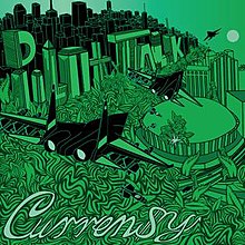
2.) Curren$y – Pilot Talk Series
Louisiana rapper Shante Scott Franklin has been making music under the moniker Curren$y since the early 2000s on Cash Money Records alongside Lil’ Wayne. Curren$y made waves in the hip-hop genre with the continued release of his Pilot Talk series beginning in 2010 with the original “Pilot Talk.”

Following the July release of “Pilot Talk,” Curren$y capitalized on the hype and released “Pilot Talk 2” in November, a short four months after PT1. The cover art followed the original “Pilot Talk” with similar font styles and depictions of the Frank Lloyd Wright-esque architecture styles seen in the mid-20th century.

This final cover art was teased on Curren$y’s instagram as the proposed art for the soon-to-be-released “Pilot Talk 3.” This design has a new color scheme and features art resembling that of recent Cartoon Network programs like “Regular Show” and “Adventure Time,” of which Curren$y is an avid fan.
The Bad
1.) Wavves – “King of the Beach”
_album_cover.jpg)
Wavves is kind of like what would happen if The Beach Boys took a ridiculously large amount of acid and tried to commune with a cat they thought was an ancient god. I love them in spite of themselves, though. “Post Acid” was my anthem for the last three months, if that tells you anything.
The album art looks like an acid trip gone wrong — or gone right, depending on your preference — with font like something from a “Fresh Prince of Bel-Air” and “Full House” mash-up and a majestic cat smoking what I can only assume is a doobie while wearing an illuminati necklace. I think when they made the art, they got super high and just kinda said, “why not lol.”
https://www.youtube.com/watch?v=pdbrQYER1fI
2.) Big Bear – “Doin’ Thangs”

I can’t lie. I love this album more than I can really explain. I’ve never listened to a second of it, and I can tell you in complete confidence that it is without a doubt the GOAT rap album. Nothing screams opulence/nothing but a G thing more than chilling with four bears wearing sunglasses and eating some grapes in your Dr. Evil suit.
The Ugly
1.) Brad Paisley – Play
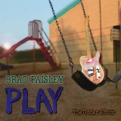
I’m honestly not the biggest country music fan in the world, but I can appreciate it. And you better believe I cry like a baby every time I watch the music videos for “Waitin’ on a Woman” and “Whiskey Lullaby.”
But holy crap, Brad. Get someone else to make your album art. Because they’ve kind of been doing the opposite of a good job. From a typography standpoint, “Play” is already in the danger zone because it uses three different fonts with three different colors. Thematically, the album art does tie in because … well, I mean, he does play a guitar a lot throughout the hour-long album.
I think my biggest issue with this album art is that it’s shockingly bland, and it just seems to have been thrown in at the last second rather than given any thought, and the album art is something that deserves a good deal of thought, since it’s the first thing people see. It’s what gives a good or bad first impression of an album. TL:DR; please don’t take a picture of your guitar sitting on a swingset and call it art. Please.
Have a fantastic Tuesday.


